

Welcome to a most recent selection of graphic design work by
Tony Frusciante


What is this?
What am I looking at?
A couple of things.
The logo that reads YNOT is simply my name written backward, Tony. I make brands and I have created so many that I made a brand of my own identity years ago. This is my creative portfolio which you can view here: tonyfrusciante.com.
The second logo, Yep™, is a subscription-based design agency I started to offer a new way for clients to hire great 360º design, art direction & creative direction. (360 = everything) This is great for agencies, and individual businesses alike. You can learn more about that here: yepdesign.co.
Lastly, this site is a reflection of brands. After a while, a designer can make so much work that weeding it out to what is best does not matter anymore. All the work is great and it has it’s own story. The work here is just stuff that I have been working on right now or the very recent past.
Have a scroll, and let me know if you find something you love, or what to know more about, or if you think it just stinks. All of your thoughts are welcome here. Collaboration is the incredible ingredient that makes all work so much better.
Branding: Fabric
This one has all involved pointing towards greatness. They want to upscale the brand visibility and communication. Less is more and this in also in progress, but I am excited for the future.
Client
Fabric


Stylescape
Website

Logo Alts Sample


Branding + BizDev: Curbwise
This is a personal project that I have been slowly working on. It’s a can-to-curb service the is intended to eliminate taking out the trash. This is relevant to many people. AirBnB home owners who do do not live at the location, elderly folks, and people who would rather have someone else make sure the cans get to the curb for pick-up and returned on the same day. This is still a WIP, but not for long.
Client:
Milo & Me: Aka: Curbwise
Site
getcurbwise.com


Curbwise Home Page


Site Icons


Door Hang

Leadership Team

Branding: Mira
Mira is a language-learning product under the Avant umbrella. This work has been happening at the end of 2024, and will continue to be developed.
Client
Avant/Mira


Extra Swag Comps


Logo Alts Sample


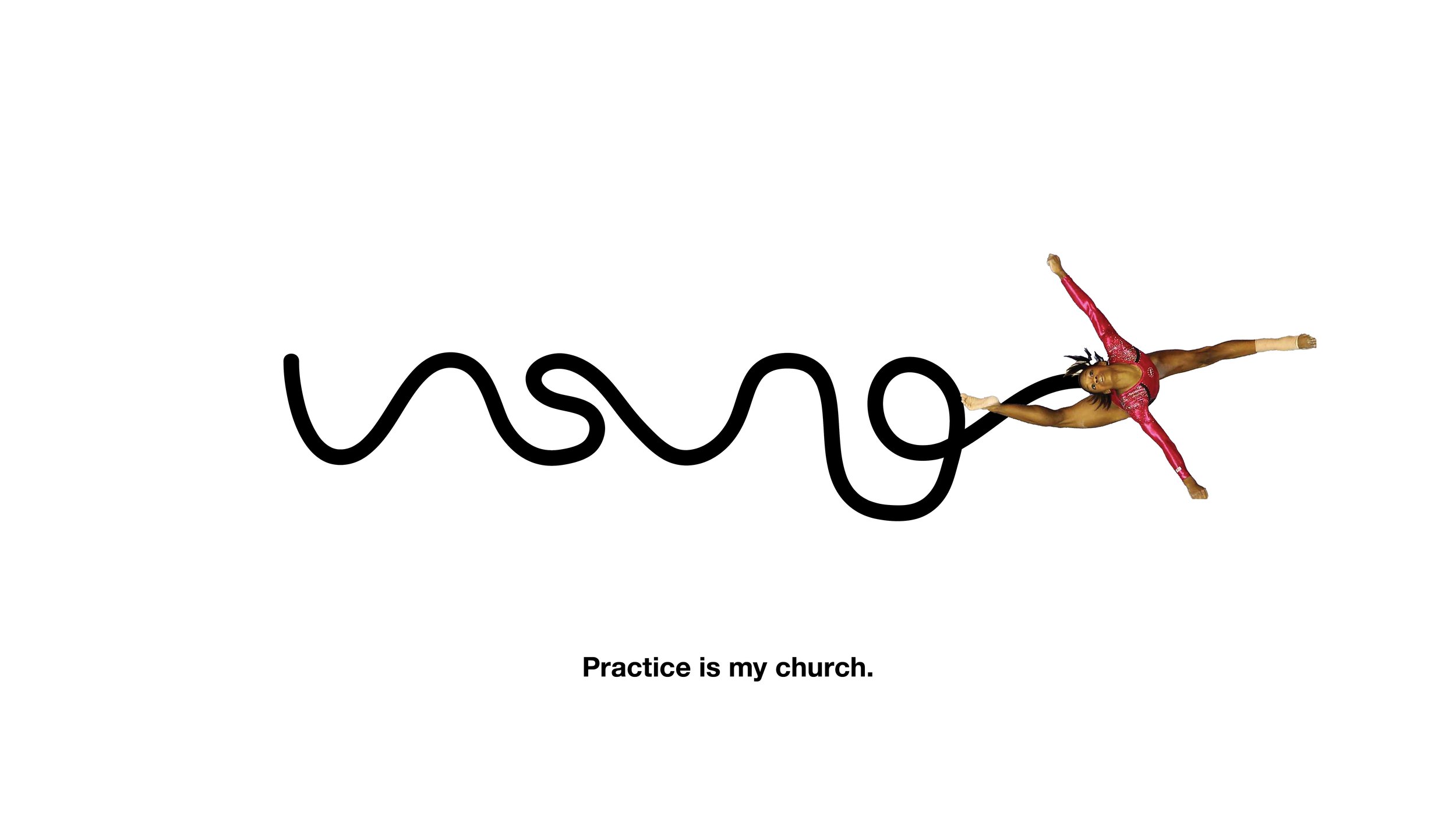
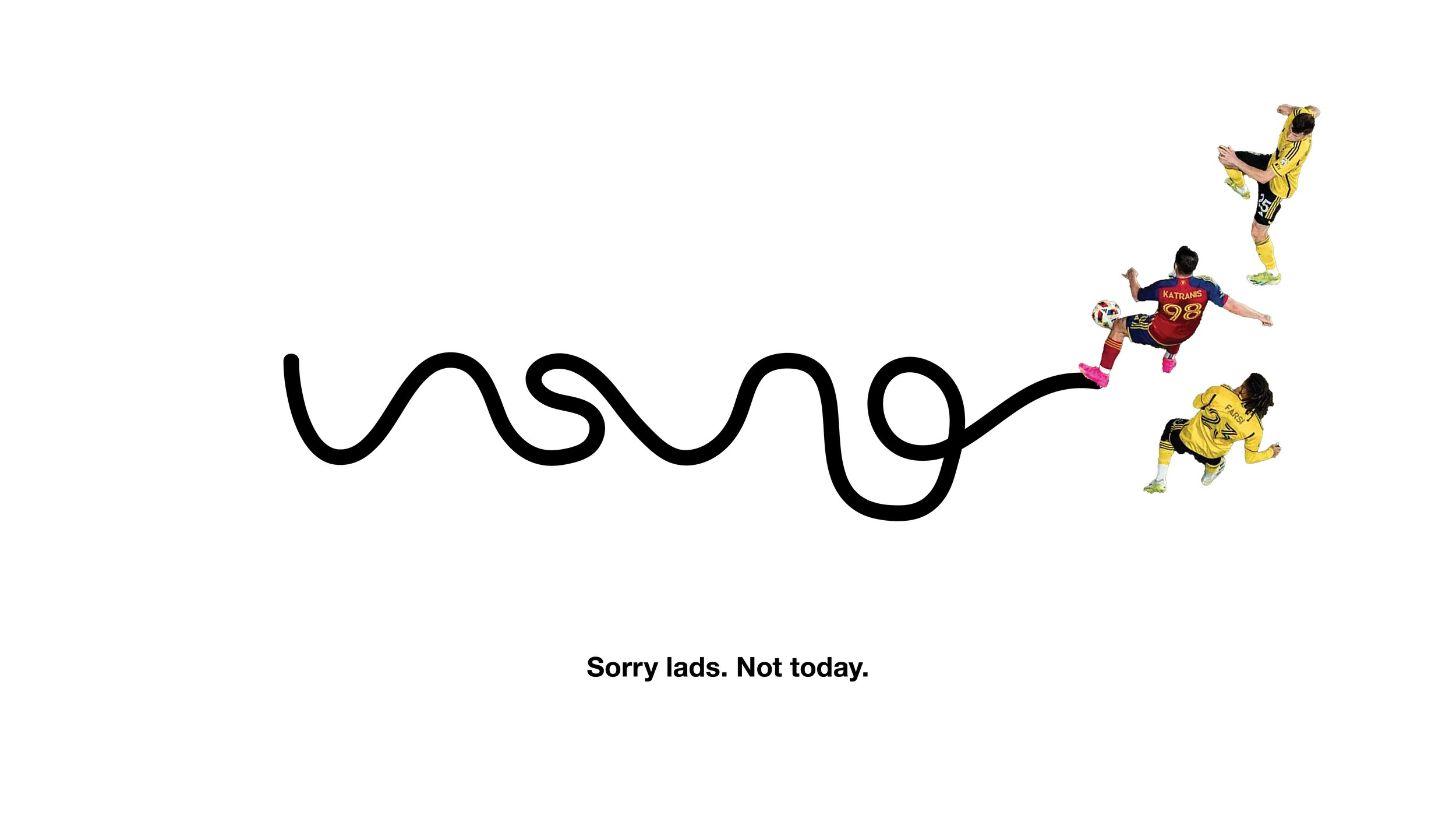
Branding: Unsung
This project was to brand a sports shoe and products brand that champions the hard work that every athlete does behind the scenes of game day.
Client
Unsung
Site
Not there yet

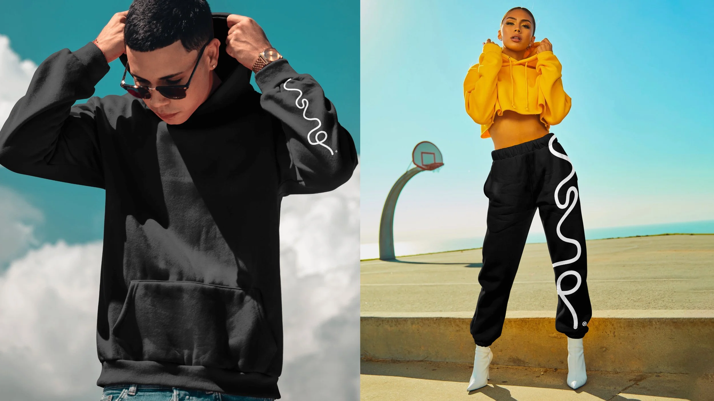


Logo Alts Sample


A Grab Bag of Typography
If you have looked at this site, and not figured out by now, We are in love with typography. This is a little space that has some type we have made recently. And we is used in the royal we, if you know your film references. What do you love? What do you hate? We accept all feedback here at the Grab Bag: hey@ohyeahyep.com.
Client
A jelly bean pile of clients & type
Year
2024/25


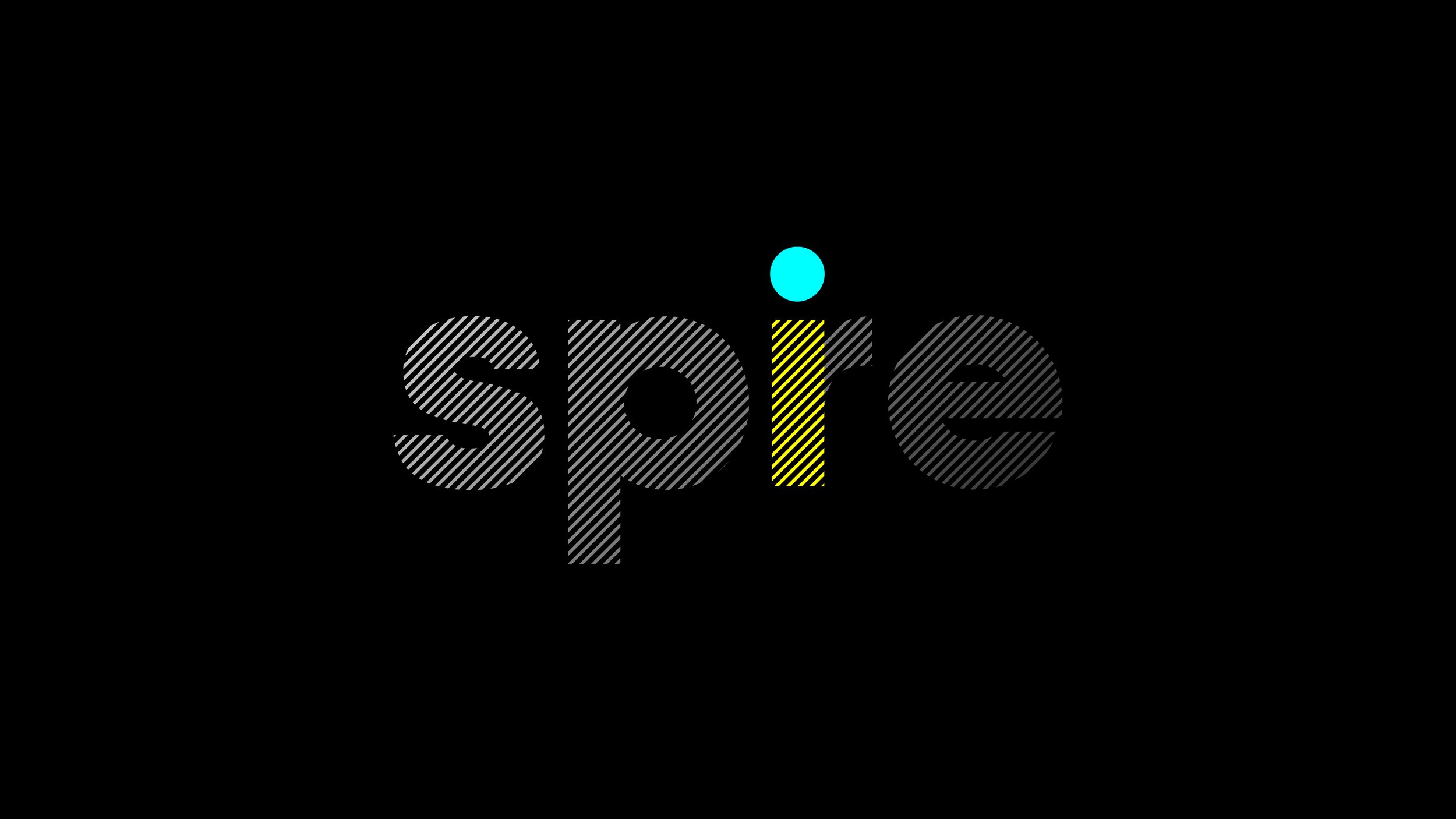
Branding: Spire
A business that is creating a more streamlined payment transaction solution. They needed a brand and a site. So, let’s make it happen.
Client
Spire
Site
paywithspire.com


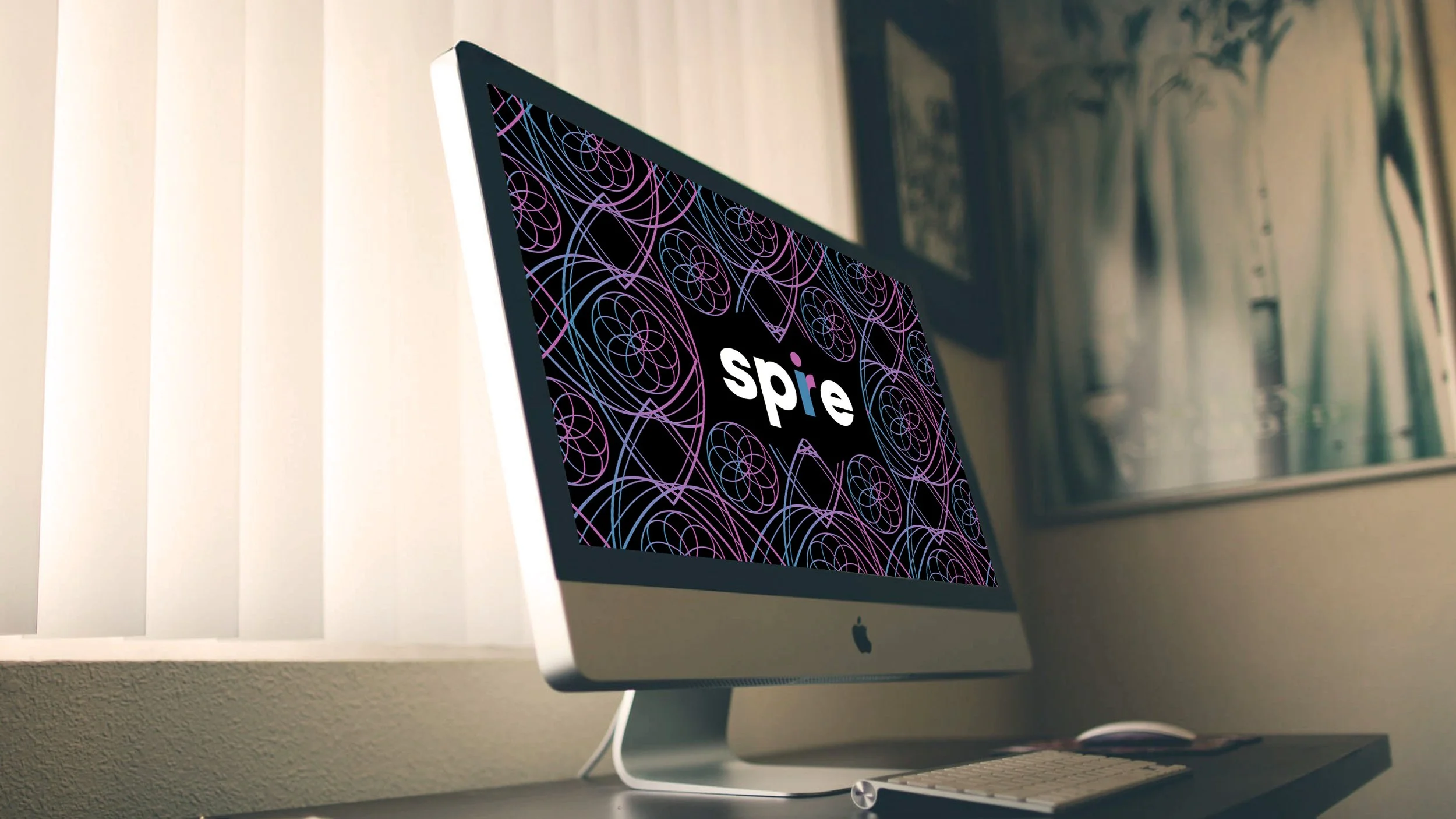

Site Design

Logo Alts Sample


Campaign: Choose Pastene
Once upon a time, in the recent present day, the Pastene company needed some visibility. They did the right thing and came here to find a new way of creating mental headspace of thier brand to live in shoppers minds, rent free.
Client
Pastene
Site
pastene.com
Copy
Mr. John Kearse


YepDesign™ is born out of a code: great work happens when effort meets smart execution. That is where our tagline “When You Know, You Know” comes from. And now, you can find our body of work at X.com.


Campaign: Made Different
This was a quick spike of work for Ciroc. It didn’t get all that far, but it did employ some classic W+K learned uses of image and type.


Branding: Glitter Pony
Lessons learned are simply that. Lessons learned. Glitter Pony was a rookie attempt at starting a creative agency. Often is the case, in my experience, is there is a lot of talk. And that is OK. Talk is about ideas. I am all in for that. Timing is also a critical part. Partnerships aligning at the same time are hard. Thus, no shame for anyone invovled.
I will say this, Glitter Pony is still a viable idea as a creative source for great work. Here is how GP 1.0 turned out. Is there a 2.0 in the future?


Website

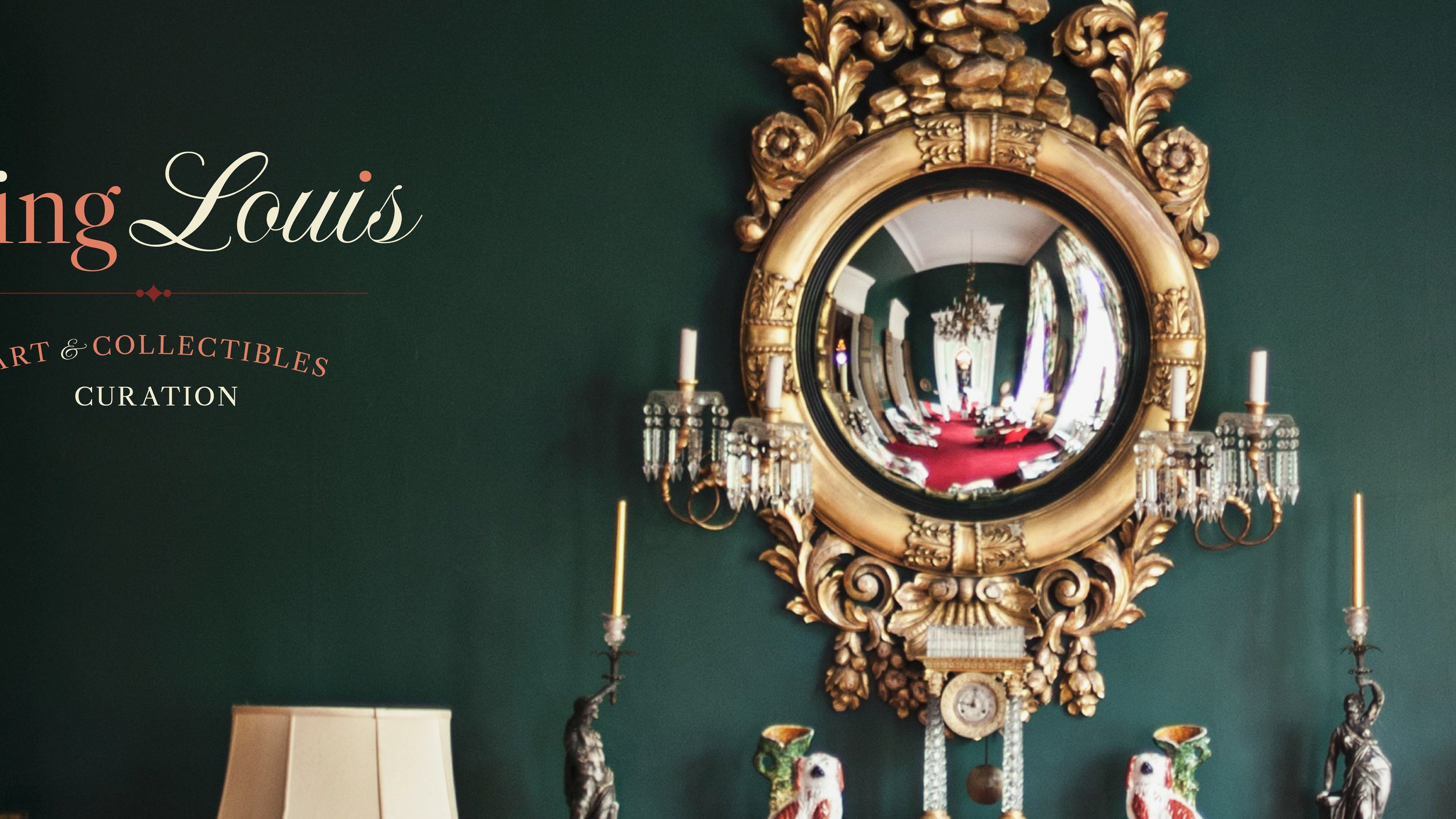
Branding: King Louis
King Louis is the moniker for contemporary art curator Deborah Walther.
Client
deborahwalther.com


Logo Alts Sample


Branding: Dretore Gallery NYC
What started out as a logo exercise, turned into branding three companies and designing a full suite of collateral for each. Dretore is located in SoHo NY, and is a fractional investment gallery that provides opportunities in Fine Art, Spirits, Sports Memorabilia, Time Pieces, and more.
Client / Brands
Dretore Gallery, Part Of, Nocor
Site
dretore.com
Collaborators
Jeffery Westbrook Photography
Pretty Awesome Editorial
JGX Group Exterior Signs
Rock Design Toronto Printing
peteshamon.com - Book Copy


Photography


Collateral


Website

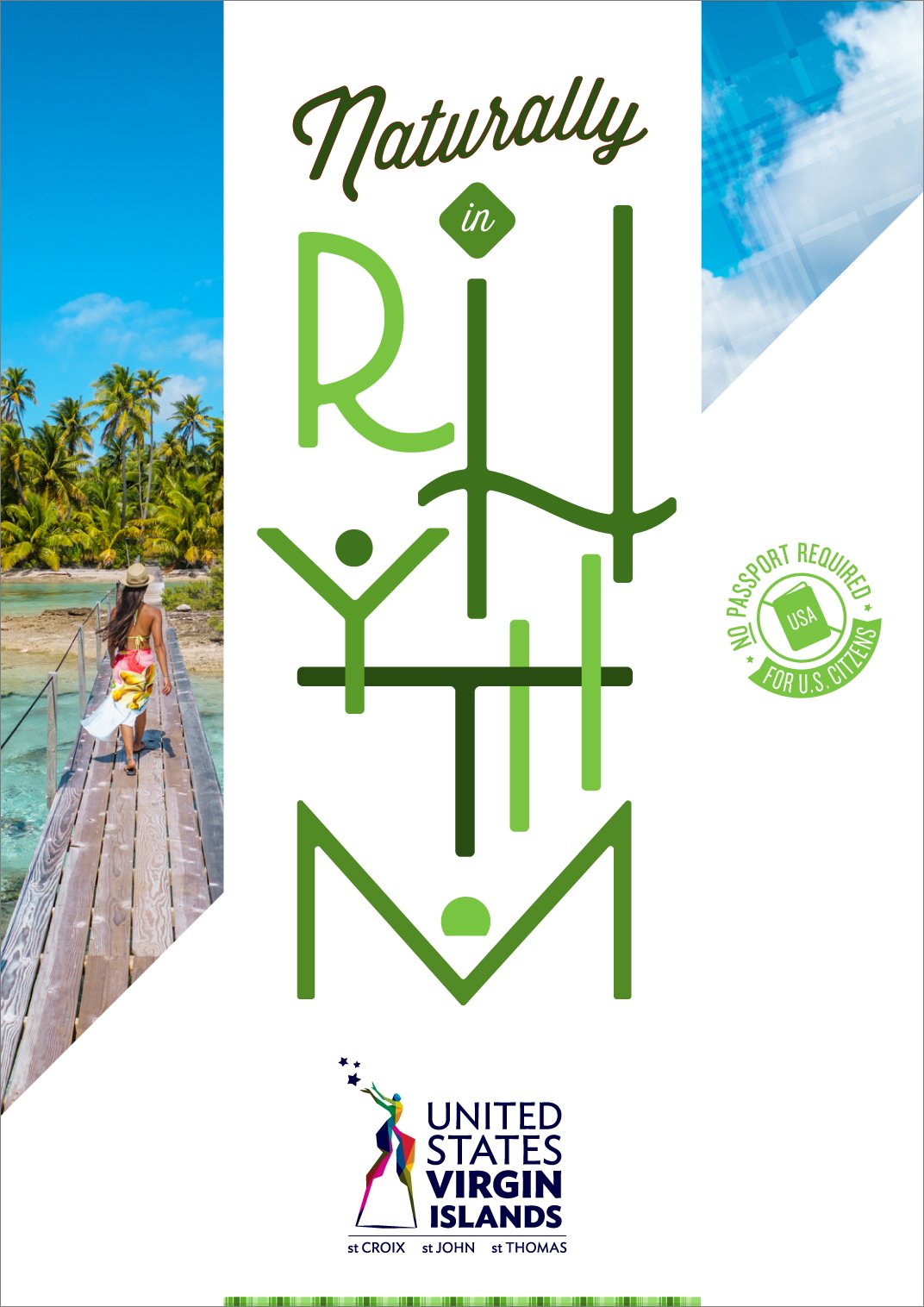
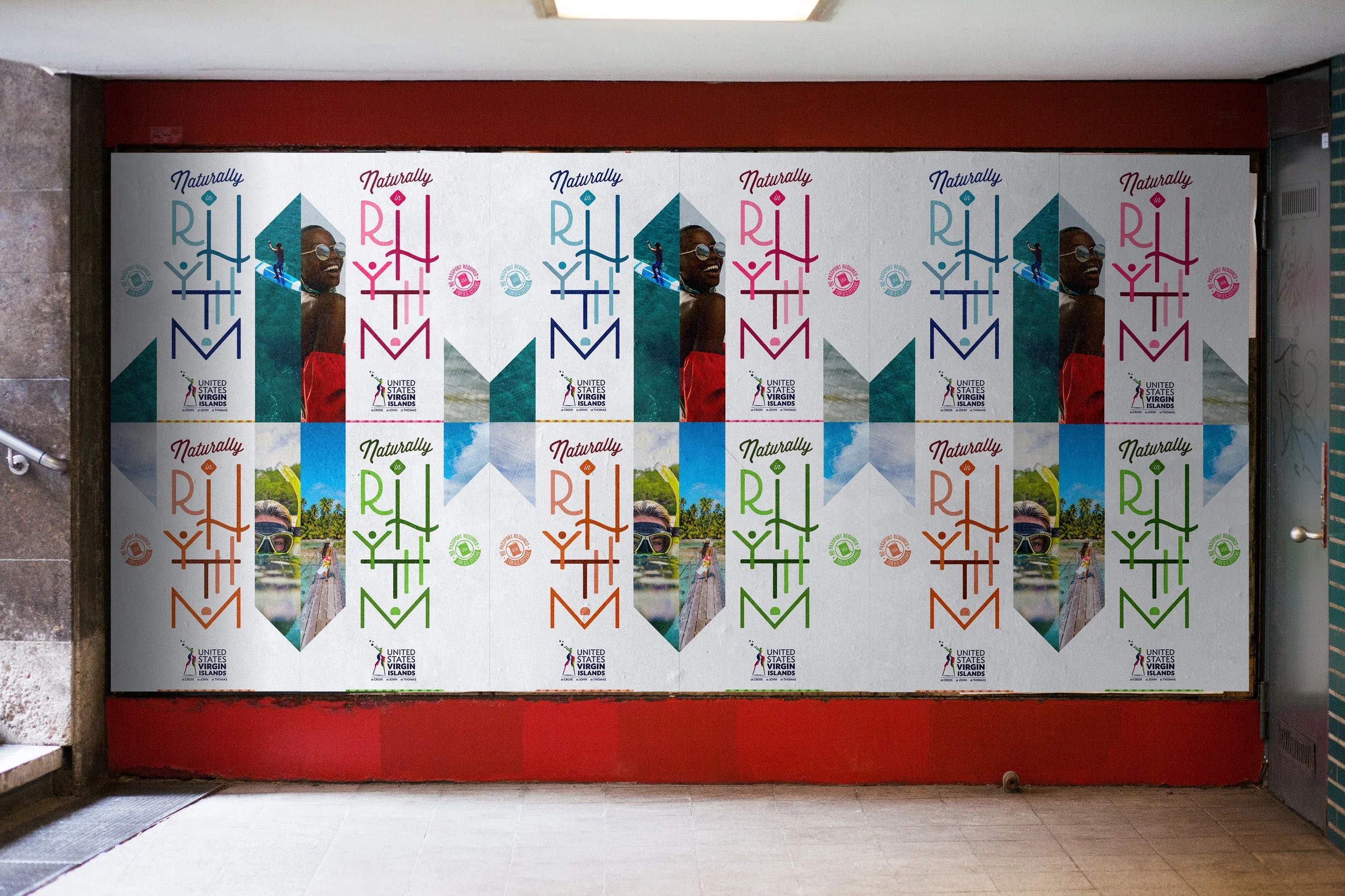
Redesign: U.S. Virgin Islands Tourism
U.S.V.I. Competes for attention in the Gulf of America tourism space. Technically, they are not in the Gulf, but the Atlantic and thus, get overlooked on occasion. The task was to reinforce the branding, display a variety of opportunities once there, and provide brand reasoning to it. Worth a second look with your tourism dollar.
Client
USVI Tourism
Site
visitusvi.com


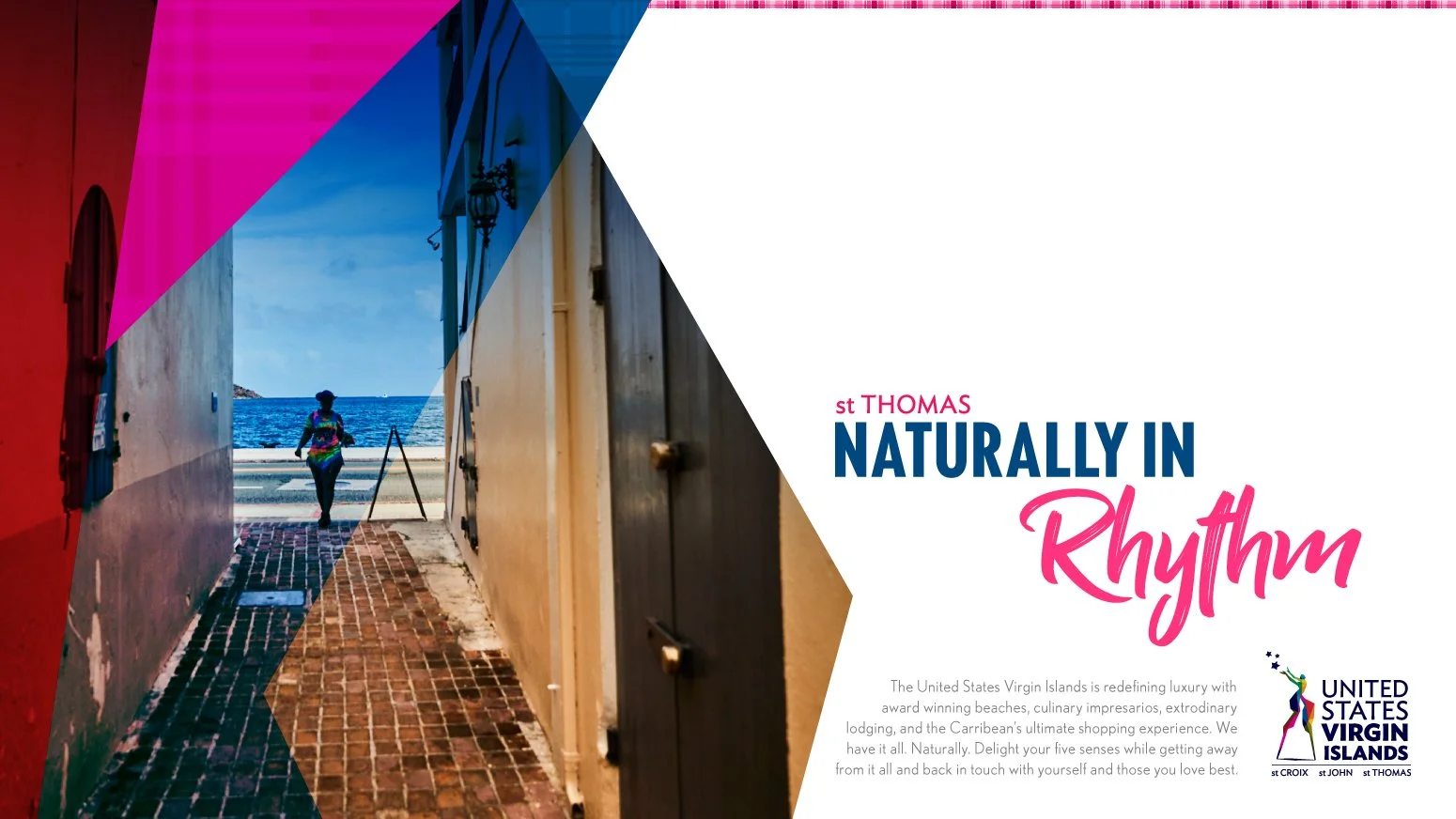


New USVI Campaign, Website, Posters


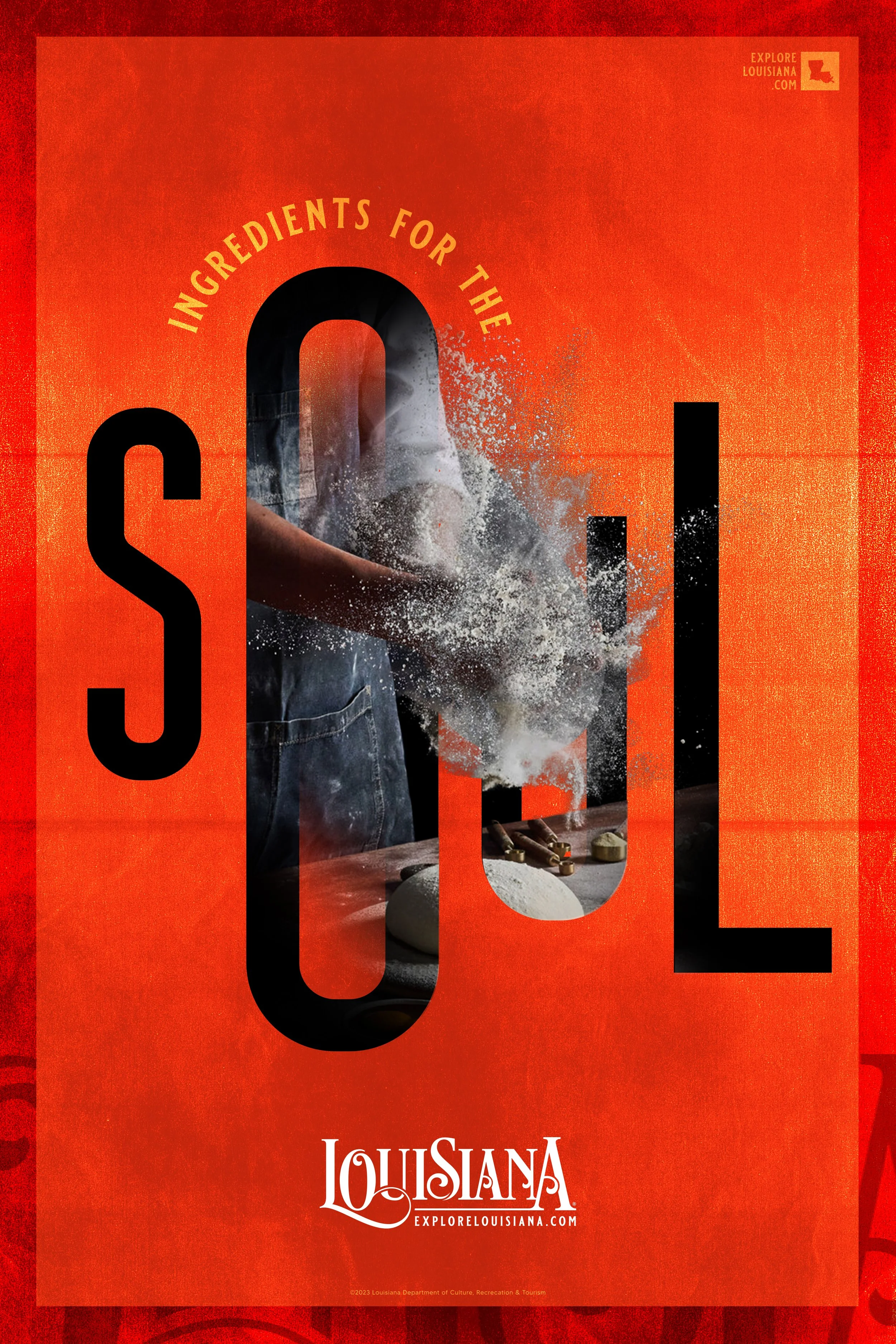
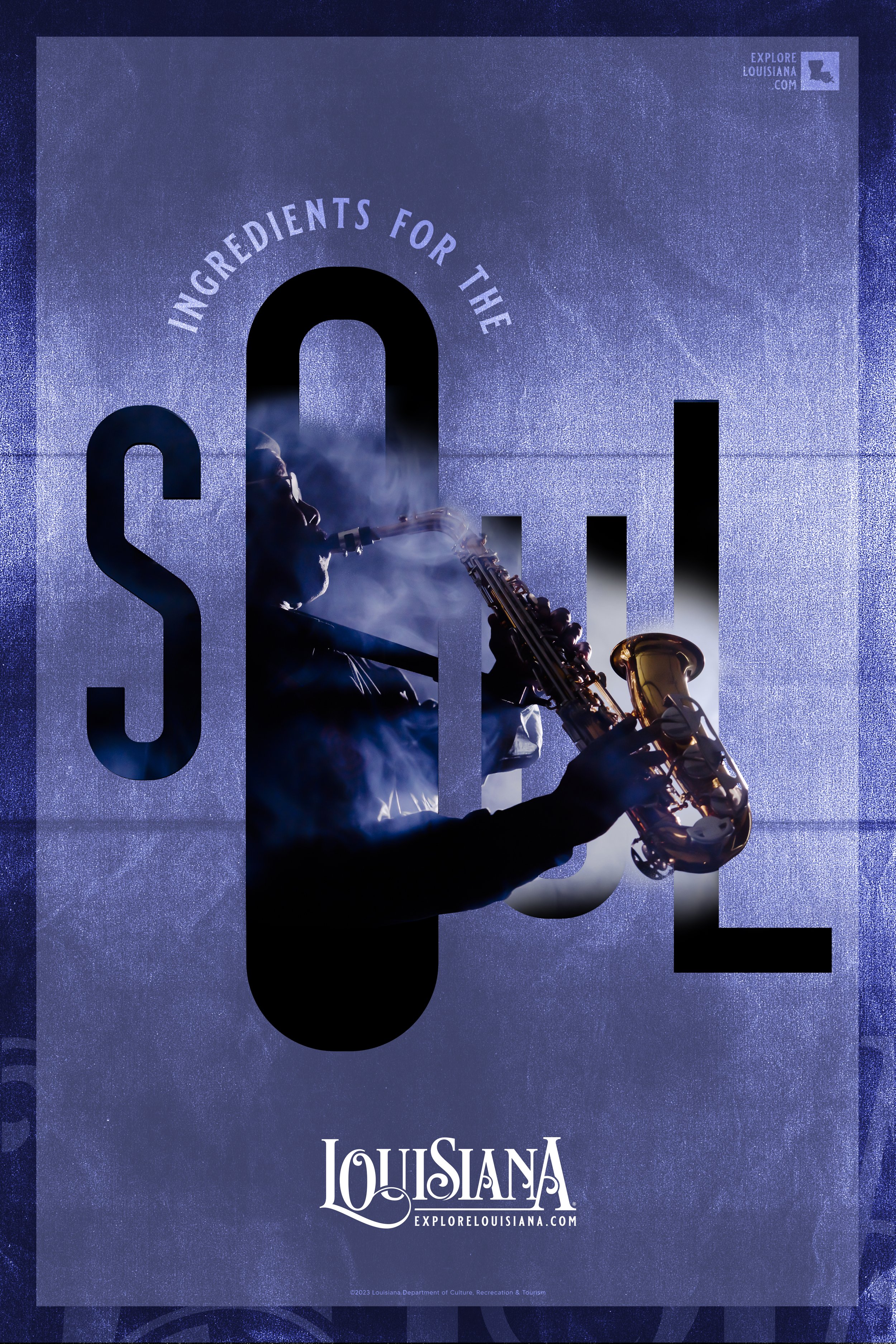
Louisiana Tourism: Pitch
Below are two different campaigns for a Louisiana Tourism pitch.
Client
Louisiana Tourism


Campaign 2


Bermuda Tourism: Pitch
An Atlantic tourist location known for it’s mystery. The following is a series of posters that aim to capture a mood and tone of memory.
Client
Bermuda Tourism
Site
gotobermuda.com


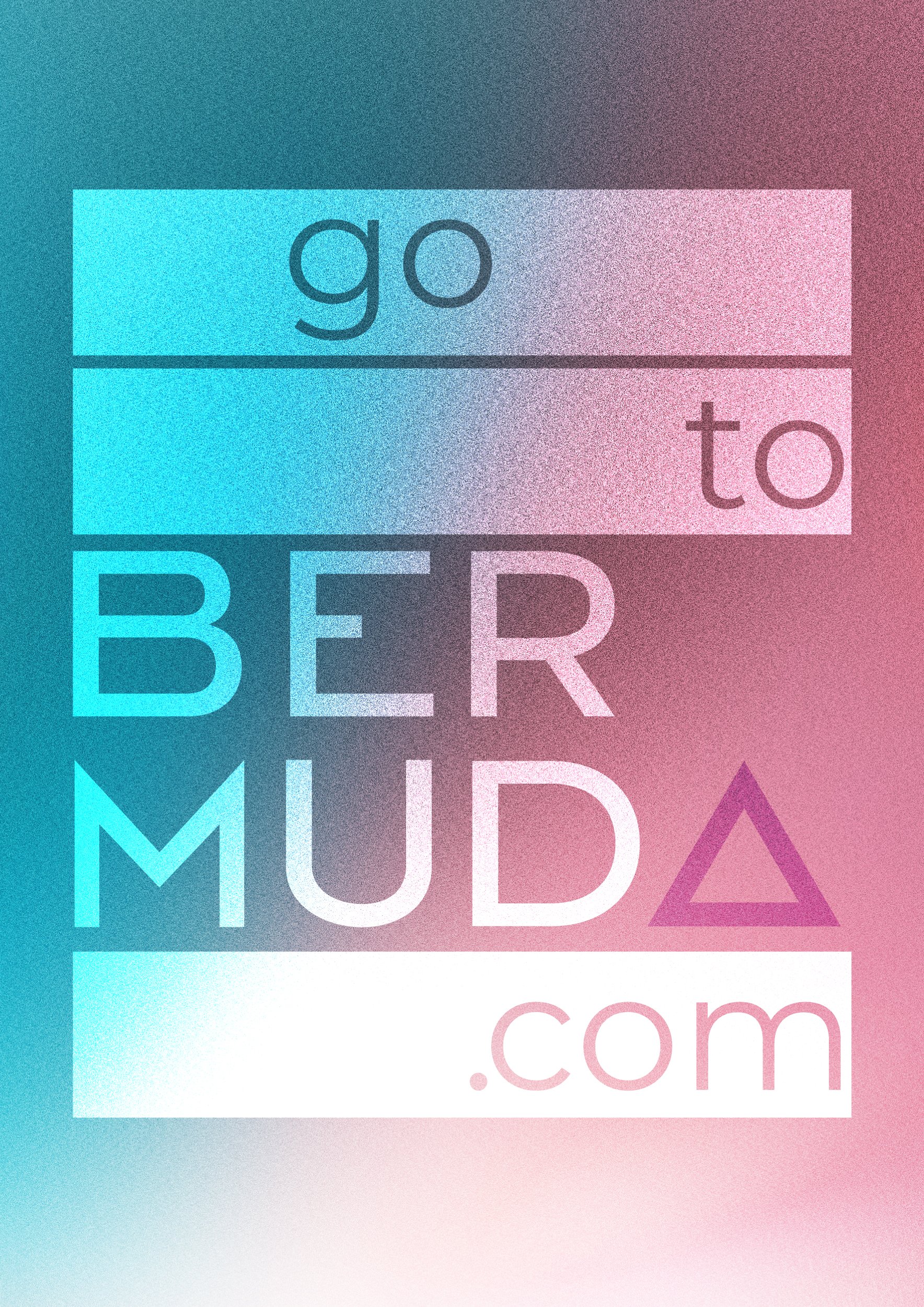
Version 2


